Here are 5 very quick animated pivot table tips to increase your pivot table skills.
Tip 1 - Quickly Remove Value Fields
Evey month I am sent a very large pivot table with approximately 1 gazillion value fields stretching across the landscape of my laptop screen. I am interested in only one of those values and it tends to be somewhere in the middle of the pivot table a couple of screen scrolls away.
As I only want one value field I’ve been faced with the choice of either removing all the extra fields one by one or starting again from scratch and building my own pivot. The latter option is not ideal as I’m happy with all the filters in place and the structure and grouping in the row and column fields.
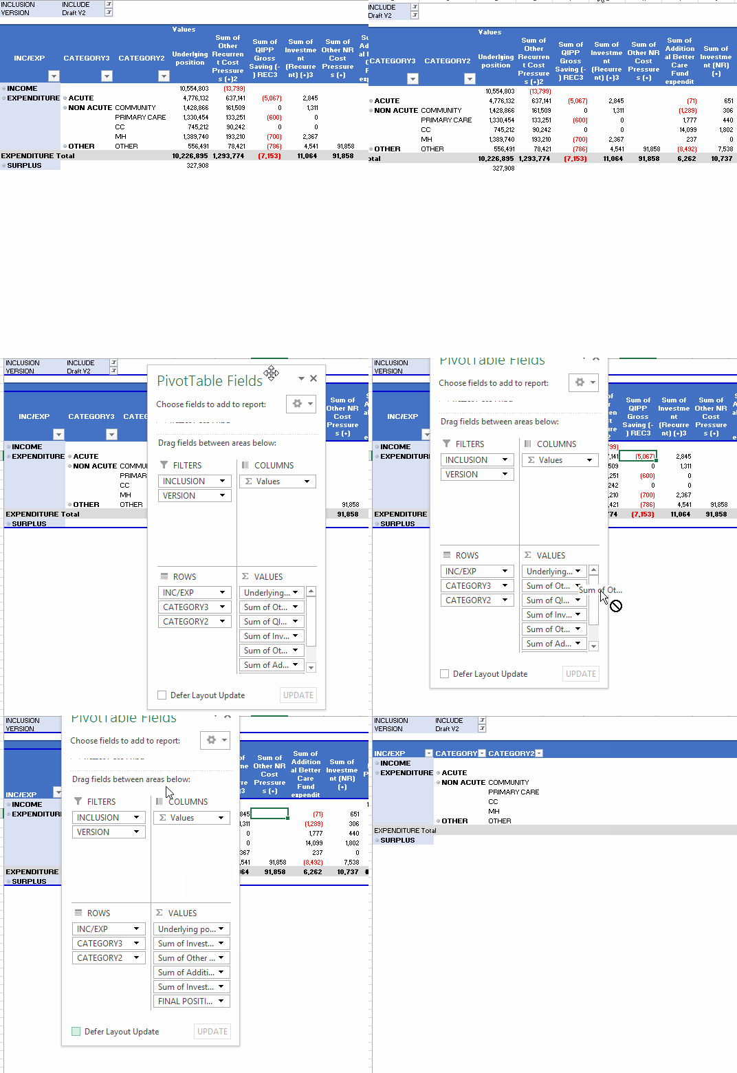
I was pretty excited last week to discover a lightening fast way to remove all the value fields in one go, while leaving the structure of the pivot table intact.
The trick is just to remove the values symbol that appears in either the row or column area.
Tip 2 - Renaming Field Headings
Pivot table fields come with a heading that reflects the original column labels and the summary method used such as “Sum of ” or “Count of “. These look pretty ugly and need to be tidied up before you can pass your pivot table off as a polished report.
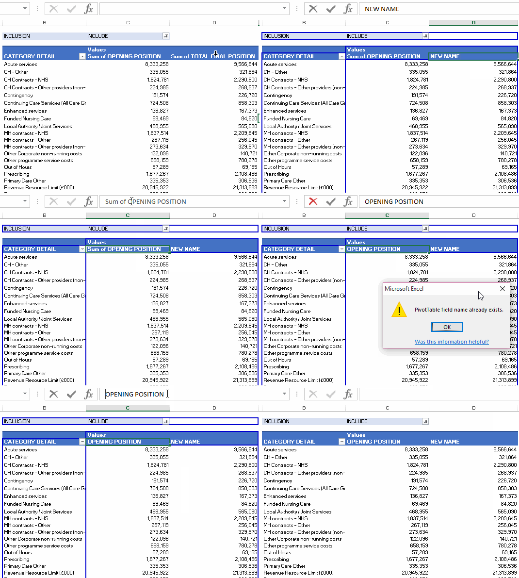
It is easy enough to change the field name, by selecting the field heading and typing over with a new name. If you try to use an existing column name you will receive an error message but you can get around that by placing an extra space at the end of your new name.
Tip 3 - Finding the Source of a Pivot Field
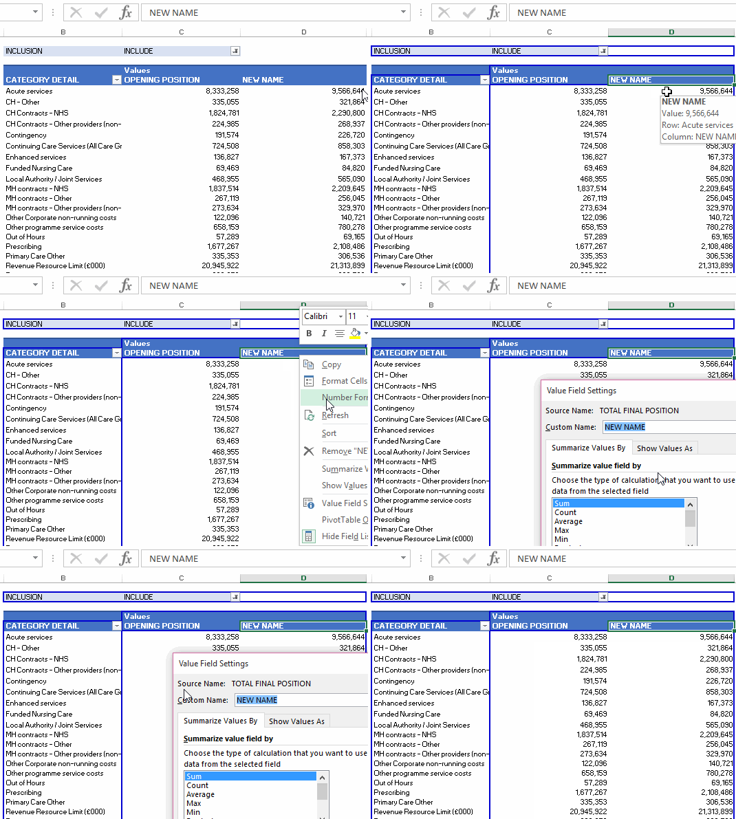
If you receive a pivot table where someone else has already read and digested tip number 2 it might be useful to know how to determine the source of the renamed data field. In other words, how to find the original column heading.
Tip 4 - Manual Grouping of Pivot Fields
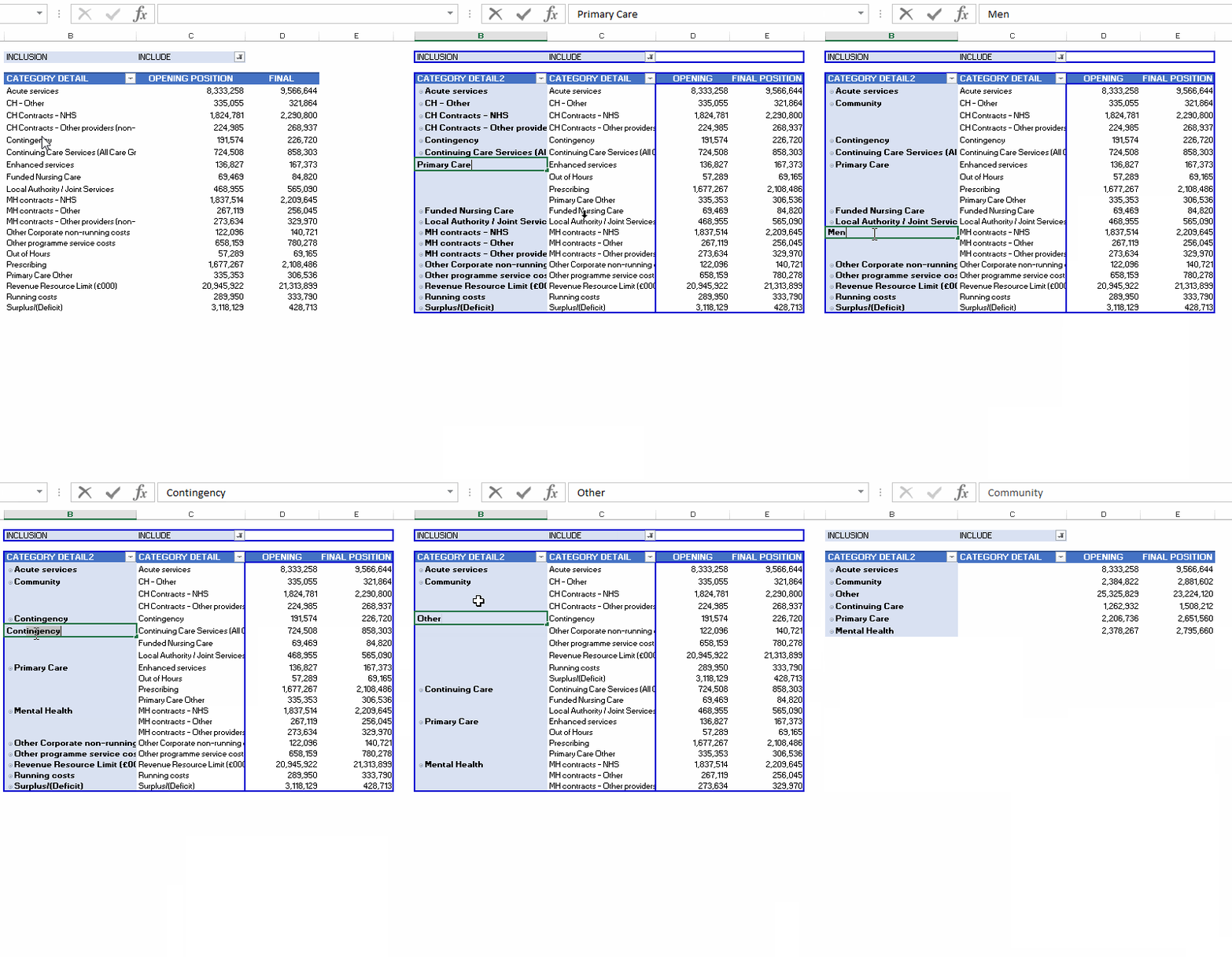
In the example pivot table above I have a lot of rows called Category Detail. This level of detail is not always the best way to display information as it can be quite overwhelming. Grouping the categories is a useful way to reduce the cognitive overload!
I’m using CTRL and click to select each category detail and then right click to select the Group function. Having grouped all the relevant categories you can collapse all the detail and reveal as required.
Tip 5 - Automatic Grouping by Value
It can also be very useful to group on numeric values as well.
In this example I am showing patient cost by patient age. Rather than showing the average cost for every age between 18 and 86, I have found it more useful to group the ages into buckets.
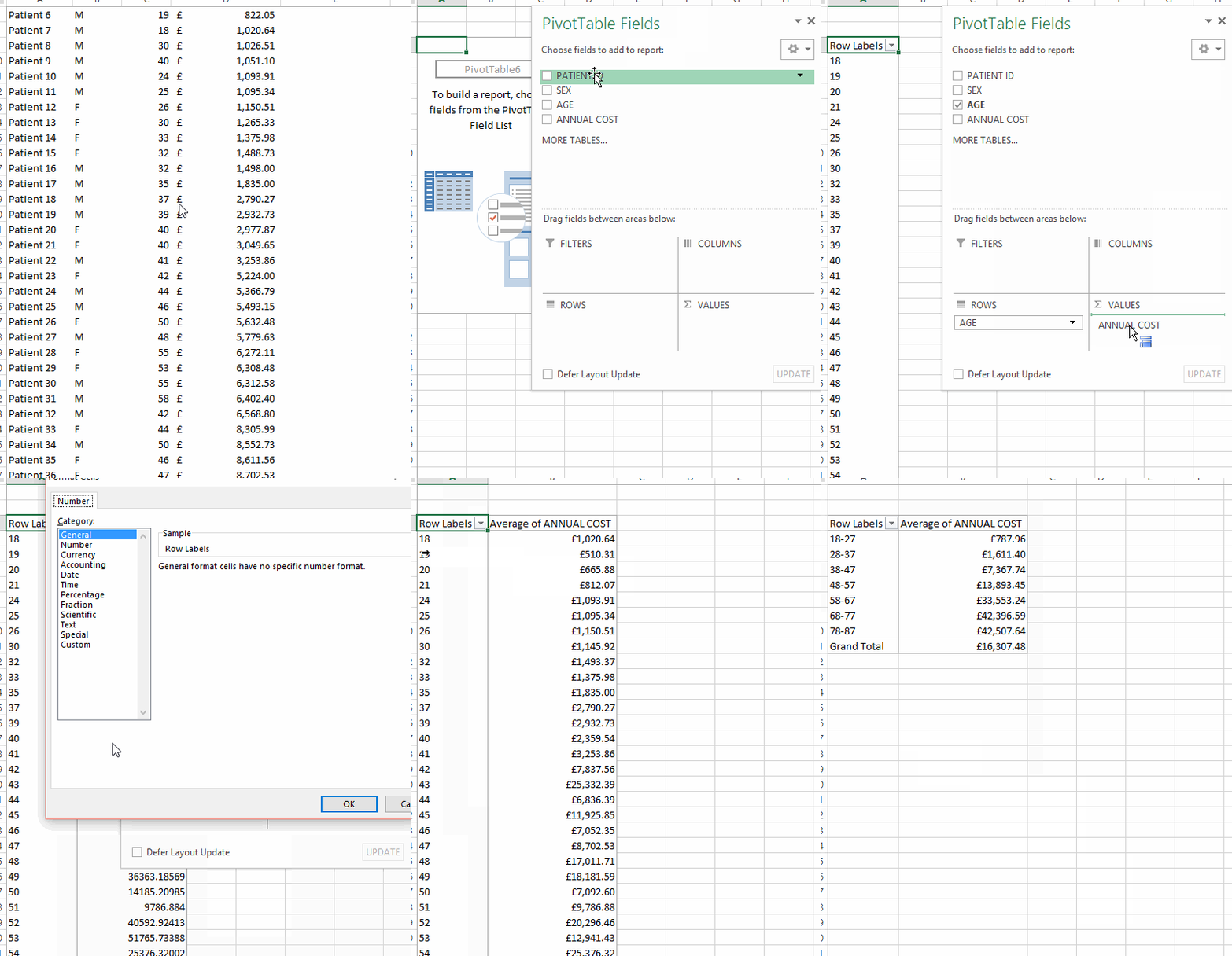
I’ve used this feature previously to create a histogram showing the spread of patient level costs per diagnosis on the NHSExcel blog.

