
This tutorial recommends some best practice for the preparation of source data that you intend to summarise by using Microsoft Excel Pivot Tables.
There are some standard rules that should be adhered to, but as with most things in life it is best to follow the 5 P’s (Proper Preparation Prevents Poor Performance) and apply some forethought to the structure of you data table.
Standard Rules for Pivot Table Data Preparation
- Start your data table in cell A1 (Preferable)
- All columns must have header field names or titles (Vital)
- Header titles should be unique, although Excel will add underscores suffixes to make them unique if you don’t (Preferable)
- Avoid blank cells especially in Column A. Avoiding blank cells in column A helps with the setup of dynamic named ranges and avoiding blank cells in the data fields helps the Pivot Table to select the correct summary function (Preferable)
- Remove any totals or subtotals in the data rows, your pivot table will do all the summarising you need (Vital)
Dr Moxie’s Data Table Rule of Thumb for powerful Pivot Tables
Build your data downwards – utilise the rows and not the columns
When I open up a spreadsheet and see that most of the available 16384 columns available (Excel 2007) have been populated with data I weep inside. It invariably means that all the useful data types have been assigned to column headers which reduces the power of the slice and dice functionality of pivot tables.
When you have used pivot tables for a while and had experience of creating reports and analysing data to uncover trends you will be able to very quickly identify good and bad source data. Here are a couple of examples to help you spot correct and incorrect pivot table source data.
Example of a Badly Formatted Sales Data Table
A simple example would be monthly sales data which will often be held in a table that looks like this, with all the sales data held in monthly columns:
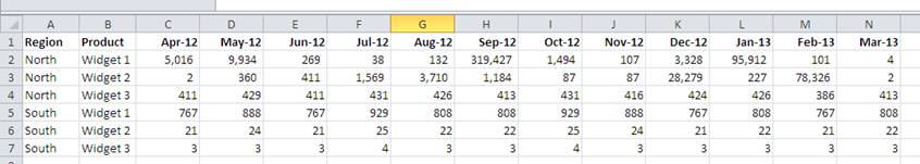
Although this is not a bad way to present data for a final report, it is not the best way to build your underlying data for driving a pivot table. It has already been summarised and this structure hinders our ability to produce different slices of the data.
It is not immediately obvious what is wrong with this until you start to build your pivot table and then attempt to cut the data to show multiple summaries.
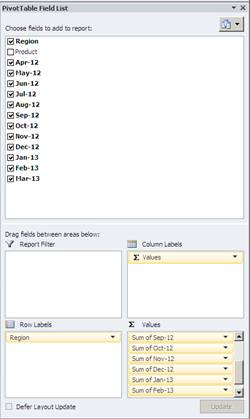
When you select your data range and start to build your pivot table you will need to add each months sales as an individual data field. This is time consuming but more importantly it removes the ability interrogate the data.
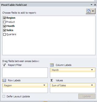
If you look in the Values box you can see multiple entries for each month with the description “Sum of Month”
The pivot table generated from this data is quite limited and doesn’t automatically apply grand totals as it considers each value field to be a completely different entity.
Dr Moxie’s 2nd Rule of Thumb for Pivot Table Source Data
All values of the same type should be reported in one column – with a single field heading
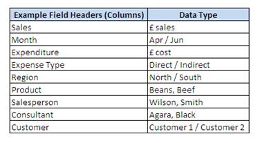
Here are some examples of typical pivot table fields or column headers:
Example of a Well Formatted Sales Data Table
Using the same data we can structure our data file to enable a much greater level of data analysis through the pivot table.

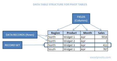
Ideally data of the same type, in this instance, monthly sales, would be in the same column and you would have another field that would enable you to identify the relevant month. The revised data table would look like this, narrow and long rather than short and fat:
Now when we prepare the pivot table, we only need to select one value field – Sales
This gives us so much scope when we attempt to generate useful reports.
If we drag the Month field into the Column Labels section we can report a month by month sales report, but as Excel now recognises our Month field as real months we can apply date groupings to summarise our data at Quarterly or Yearly intervals.
Here’s a sample of easily spun reports which rely on the underlying data being structured correctly.
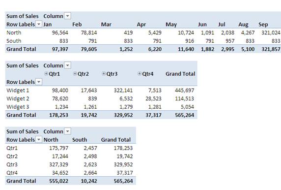
If we wanted to do this with the badly formatted data we would have to use calculated fields to say that for example, Q1 = Jan + Feb + Mar or bring additional subtotal columns into the data which is not ideal at all.
What to do if you data is in the wrong format for a pivot table
Sometimes the data arrives on your desktop already formatted and you haven’t had chance to apply the appropriate restrictions on the data structure. At this point you need to weigh up the pro’s and con’s of re-jigging the data before you start to analyse it. With some tasks it is certainly worth re-assembling data into a structured tabular format so that you can use all the summary features available to well-ordered pivot tables. If you don’t you may quickly slip into the old world of excel where data was analysed by use of the most horrendous an indecipherable formulas.
It’s usually worth going back to the person who provided the data in the first place to see if they can provide the data in the correct structure. In many cases I find that poor data structure is a result of someone trying to be too useful, they start with a flat file and then they summarise before sending to you.
If you have to reverse engineer your data back to an ideally structured flat file, you might find this post useful which explains how to generate a flat data table from a crosstab.
Make your life easy – embrace pivot tables and build clean data tables.