
An easy and risk-free way to compare data from two or more sources is by using a pivot table. In this tutorial I will demonstrate why you should add pivot table comparisons to your data analysis toolbox and forget about the inferior vlookup function.
Why VLOOKUP is not the best way to compare data sources
I regularly see people using vlookups to compare two sources of data. This can be problematic as you have to consider differences in the comparator fields or risk producing misleading analysis.
Take for example the monthly sales lists for a series of products.
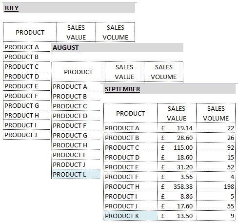
If I take the July sales list and then use a vlookup formula to bring in the comparative sales value from August and September, I will run into problems because PRODUCT K and L didn’t appear on the sales report for July. In fact there are no months where all products appeared in the sales list.
So the VLOOKUP trick only allows me to compare data that is common between each list, which is not what I want.
People get around this problem by trying to identify a full list of products and then using this to perform their VLOOKUP method.
The other problem I have with the VLOOKUP method is that it is not very agile.
Let’s say you have produced a full list of products and then completed a VLOOKUP to bring in all the Sales Values for July to September, you present your table and are then asked – “That’s great but how does the Sales Volume compare?”
Now you have to go away and write another 3 VLOOKUP formulas to bring across the Activity figures as well. Your data will look something like this:
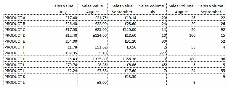
Once you’ve started building your data table like this you’ve lost the game as far as I’m concerned. Getting a chart off this data is tricky and performing any analysis is going to require you to write more formulas and before you know it, you will have a horizontal spreadsheet from hell. If you want to understand why I consider this to be ugly data, check out my tutorial that shows you how to prepare perfect source data for pivot tables.
How to compare data with Pivot Tables
First you need to stack your data sources and create a new column that indicates the basis of the comparison. In this case, the fundamental difference between the sources of the data is the Sales Month, so I want an additional column called Month.
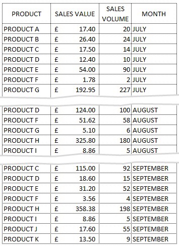
Once you’ve stacked the data you are ready to pivot.
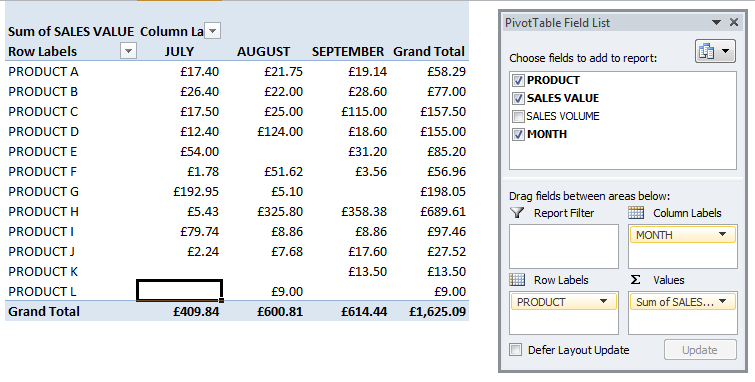
If you put your comparator filed in the column labels section you can see the corresponding values side by side and the benefits of the pivot table are immediately obvious when you look at the Product List – this now shows a complete product list across all 3 months. Any month missing from the original sale list shows up as a blank.
The other benefit of using pivot tables for data analysis is agility.
If you now want to compare activity volumes instead of values you can switch out SALES VALUE for SALES VOLUME in the Values section. You could even have both fields showing in the pivot table if you want to go crazy.
When it comes to actually performing some analysis, you can also use the pivot table directly rather than creating more columns of formulas. So for example I might want to see what the difference is between each months data. All we need to do here is to amend how the pivot table shows the values.
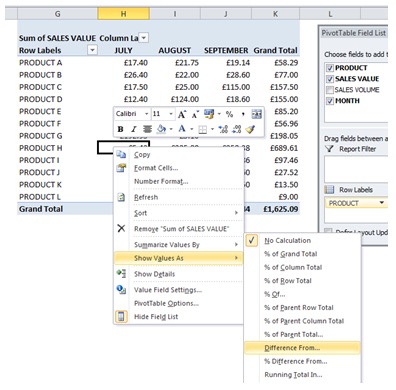
Access this by right clicking on the pivot table
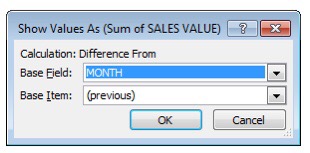 It defaults to showing the data with No Calculation but there are many options. If we choose Difference From, we then have to choose a Base Field which in this case should be MONTH and then a Base Item.
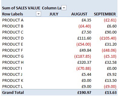
If you leave the Base Item as (previous) it will show the following table with blanks in July (as we don’t have JUNE’s data) and data in August which represents difference between August and July and then data in September which is the difference between September and August.
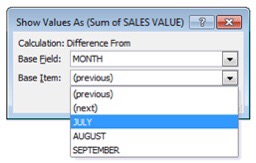 If you actually wanted to see the differences between each month with July being the comparator month, you would just change the Base Item from (previous) to JULY
Hopefully you’ve seen enough to realise that the pivot table is a great tool for easily comparing datasets and that once you’ve taken the time to stack your data, you can slice and dice with ease.